
|
LILLYROBOT.COM |
HTML5
HTML 5 is the newer version of HTML. It has been updated with several new elements and some of the old elements from html 4.01 are being phased out.
The DOCTYPE declaration <!DOCTYPE html> in HTML5 is simple compared to HTML 4.01. It tells the browser which version of HTML you are using.
The following tags have also been simplified:
- <meta charset="UTF-8"/>
The character encoding(charset) declaration, which goes inside the head tag. It represents all the characters in your webpage. - <html lang="en"/>
This tells us the primary language of the webpage is in English. This tag goes after the DOCTYPE declaration
Semantic Elements
- <header></header>
- <section></section>
- <articles></articles>
- <aside></aside>
- <footer></footer>
In the older version of HTML the <div></div> tags were used with the id attribute to create sections for the header, navigation, content and footer. e.g. <div id="header">. Now with HTML5 we can avoid the div tags and use the more meaningful tags.
Header
The header element <header> </header> does exactly what it says. A header is added at the top of the document. It can also be added to sections and articles.
<header>
<h2>My Header</h2>
</header>
Displays
My Header
Nav
The nav element <nav> </nav> is used when we want to add links, so our viewers can navigate to other pages or to different parts of the the same webpage.
<a href="#">Home</a>
<a href="#">HTML</a>
<a href="#">CSS</a>
</nav>
Displays
To display each link in a new line we use the display:block property of CSS.
<a href="#">Home</a>
<a href="#">HTML</a>
<a href="#">CSS</a>
</nav>
Displays
Section
The section element <section></section> reperesents a generic document. It is used in general with contents that are related to each other. You can have one or more articles inside the section or you can have a section inside an article; you can also use the headings h1 to h6 to help you structure the document.
<section>
<h1>Travel to Europe</h1>
<article>
<h2>France</h2>
<p>The best place to go...</p>
<article>
<article>
<h2>Italy</h2>
<p> The best place to go...</p>
</article>
</section>
Displays
Travel to Europe
France
The best place to go...
Italy
The best place to go...
Article
The article element <article></article> is used when you have a piece of content that is independent from the rest of the content on the webpage. This could be a forum post, newspaper article, a blog entry or a piece of article you have written e.g. best restaurants.
<article>
<h2>Curry Dish </h2>
<p>
Today, I have decided to make a hot curry dish with loads of...
</p>
</article>
<article>
<h2>Safari Trip</h2>
<p>
The safari trip will start very early in the morning at...
</p>
</article>
Displays
Curry Dish
Today, I have decided to make a hot curry dish with loads of...
Safari Trip
The safari trip will start very early in the morning at...
Aside
The aside element <aside></aside> is used when you want to add information that is indirectly related to the content around the aside element e.g pull out quotes from an article.
<h2>Mediterranean Almonds</h2>
<p> In this section we are going to look at the mediterranean history on almonds...</p>
</section>
<aside>
<h3>Which country produces the most almonds? </h3>
<p>The largest producer of almonds is United States followed by Spain.</p>
</aside>
Displays
Mediterranean Almonds
In this section we are going to look at the mediterranean history on almonds...
Footer
The footer element <footer></footer> contains information such as the author, copyright, etc. The footer is placed at the end of the document. You can also add a footer to any of your articles and sections.
<p> Copyright © 2017. Lillyrobot.com. All rights reserved.</p>
</footer>
Displays
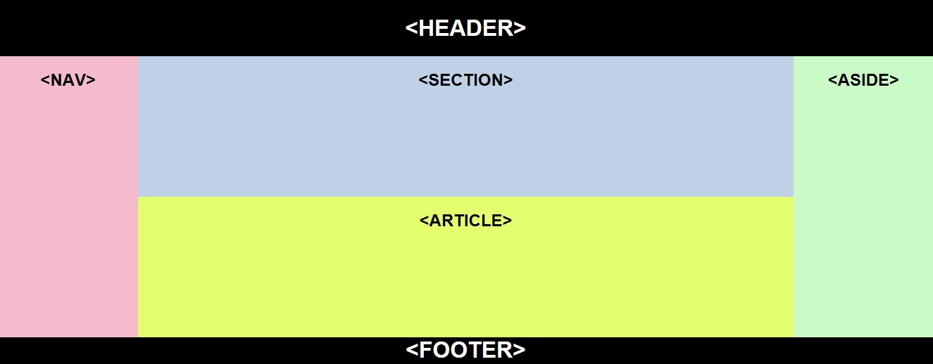
Have a look at the example below on the layout of a web page, using the above semantics.
More New Elements!
| Element | Description |
|---|---|
| <figure> | groups embedded content such as images or diagrams with <figcaption> |
| <figcaption> | the caption gives an explanation of the embedded content such as an image or diagram |
| <time> | Defines a date/time (represents time on a 24 hour clock). |
| <hrgroup> | Groups the heading tags <h1> to <h6>. |
| <mark> | Defines marked/highlighted text. |
| <details> | The details element is used to hide or view additional details from the user. |
| <datalist> | Specifies a list of pre-defined options, each one is inside an option element <option>. |
| <address> | Specifies contact information about the author of the article/document. |
Form Attributes
| Attributes | Description |
|---|---|
| autocomplete | The form's autocomplete attribute specifies if the form should have the autocomplete on or off. If on then it will autocomplete the form and if off then the user completes the form. |
| novalidate | The data in the form field is not validated when the form is sbumitted. |
Input Attibute
Required
The required attribute is used when you want the user to fill in the field before they submit the form.
Enter password:
<input type"text" name="password" required />
<input type="submit" name submit value="Send"/>
</form>
Displays
Click the Send button and see what happens.
Placeholder
Displays a brief hint to help the user understand what data should be entered inside the field.
Code:
<input type"text" placeholder="id" name="id" />
</form>
Displays
Pattern
The pattern attribute with the predefined regular expression checks that the correct data format is entered inside the field.
It can be used with text, url, search, tele, email and password input type.
Course:
<input type"text" name="id" pattern="[0-9]{5}" title="id no"./>
Name:
<input type"text" name="first" pattern="[A-Z]{10}" title="caps"./>
<input type="submit"/>
</form>
Displays
The Course input field must contain 5 numbers from 0 to 9.
The Name input field must contain 10 characters in capital.
List
The list attribute works with the datalist element. The datalist is a list of options.
The list attribute allows the user to input one of the options into the input field.
The id attribute of the datalist must have the same name as the list attribute.
Select a fruit:
<input type"text" list="fruit">
<datalist id="fruit">
<option value="apple">
<option value="pear">
<option value="orange">
<option value="banana">
</datalist>
Displays
Read Only
The readonly attribute is similar to the disabled attribute; it does not allow the user to enter data into the input field. The only difference is that when the form is submitted the disabled attribute value is not submitted.
Job Refs:
<input type="text" name="job refs" value="k234" readonly/>
Name:
<input type="text" name="name" value="" />
</form>
Displays
The Job Refs text box is read only so you will not able to enter or delete any text. Why don't you try it!
More Input Attributes
| Attributes | Description |
|---|---|
| autocomplete | The autocomplete attribute specifies if the input field should have the autocomplete on or off. If on, it will autocomplete
the field
and if off then the user will have to complete the field. It can be used with text, url, search, tel, color, datepickers and password input type. |
| step | The step attribute is used for the accurancy of data collection; it is used with an input type such as the number,
range or time. The min and max attribute can also be used along with the step attribute. |
| autofocus | The autofocus attribute is used to automatically focus on an input element, when the page loads. |
| formaction | The formaction attribute specifies the URL page that the data is to be sent to when the form is submitted. It can only be used with submit and image. The formaction attribute overides the form's action attribute. |
| formenctype | The formenctype attributes specifies how the form data should be encoded. It can only be used with submit and image. |
| formmethod | The formmethod attribute specifies the HTTP or URL method of sending data to the server. It can only be used with submit and image type. The formmethod attribute overides the form's method attribute. |
| formnovalidate | The formnovalidate attribute specifies which input element is not to be validated when form is submitted. It overides the novalidate attribute of the form and is used with the submit button. |
| formtarget | The formtarget attribute specifies the window page where the form results are to be displayed when the form is submitted. It overides the target attribute of the form and is used with the submit and image type. |
| min and max | The min and max specifies a minimum and maximum value of an input field. It is used with number, range, date, datetime, datetime-local, month, time and week input type. |
Input Type
Search
The search input type is used as a search field.
Search:
<input type="search" name="search">
<input type="submit" value="Search">
</form>
Displays
Color
The color input type lets the user pick a color from the color picker.
Note: Does not work in all browsers.
Select a color:
<input type="color" name="col">
</form>
Displays
Date
The date input type is used for entering a date by the user.
Note: Does not work in all browsers.
Select a Date:
<input type="date" name="date">
</form>
Displays
More Input Type!
| Input TYPE | Description |
|---|---|
| <input type="email"> | The input email field is used for entering an email address. |
| <input type="month"> | The input month field is used for entering a month. |
| <input type="number"> | The input number field is used for entering a number - the min and max attributes are used to specify the min and max numbers allowed. |
| <input type="tel"> | The input tel field is used for entering a telephone number. |
| <input type="range"> | The input range displays a slider control - the min and max attributes is used to specify the min and max ranges. |
| <input type="time"> | The input time lets the user select a time. |
| <input type="week"> | The input week lets the user select a week and year. |
| <input type="datetime"> | The input datetime field is for entering a date and time. |
| <input type="datetime-local"> | The input datetime-local field is for entering a date and time - it omits the time zone. |
| <input type="datetime-local"> | The input datetime-local field is for entering a date and time - it omits the time zone. |
Canvas
The <canvas> element is used with JavaScript for drawing graphics.
Inside the start canvas tag, we have the width and height attribute, which sizes the canvas; it also has an id attribute, which refers to the JavaScript codes.
You can add a border to an empty canvas.
<canvas id="canvas1" width="300" height="150" style="border: 1px solid black" >
</canvas>
</body>
Note: The id attribute is canvas1.
The coding for JavaScript goes inside the <script></script> tags.
document.getElementById("canvas1")
We are instructing this method to find our id <canvas> called canvas1.
getContext(2d)
This method returns the drawing context; the parameter passed is "2d", which is the dimension. It is a built in HTML object, with all the drawing properties and methods.
fillStyle This property sets the colour to fill the drawing.
fillRect (left,top width,height)
This method draws a filled rectangle. The x,y are the coordinates. If the values for left and top are (0,0) then the drawing starts at the top left-hand corner.
Now let us see the big picture using the above properties and methods.
<script>
var ourCanvas = document.getElementById("canvas1");
var x=ourCanvas.getcontext("2d");
x.fillStyle="green";
x.fillRect(0,0,200,100)
</script>
<head>
<body>
<canvas id="canvas1" width="300" height="150">
<canvas/>
<body>
Note: The second canvas fillRect has been changed to fillRect(40,40,200,100).
Displays
fillRect(0,0,200,100)
Displays
fillRect(40,40,200,100)
There are several properties and methods you can use on your canvas, which are not covered here. However, have a look at the examples below, where we have added a rectangle and some text.
x.font="italic 40px arial";
x.fillStyle="blue";
x.fillText("LILLY ROBOT",140,50);
// rectangle
x.fillStyle="red";
x.fillRect(10,10,200,100);
Displays
x.font="bold 30px Verdana ";
x.strokeText("LILLY ROBOT",30,80);
Displays
We can draw any shape using the beginPath() and closePath() methods.
x.beginPath();
x.arc(150,70,60,0,2*Math.PI);
x.fillStyle = "red";
x.strokeStyle="blue";
x.fill();
x.stroke();
x.closePath()
Displays
Property and Method
Below is a table showing some of the properties and methods of the canvas.
| PROPERTY |
|---|
| Text |
| font - sets the font style e.g. font=" 20 Arial" |
| textAlign - sets the alignment of the text e.g. textAlign="left" or "top, middle, alphabetic, ideographic, bottom" | textBaseline - sets the baseline where text sits e.g textBaseline="hanging" or "start, end, right, center" |
| Colours, Styles and Shadows |
| strokeStyle - sets the outline color for the shape e.g. strokeStyle="red" the default colour is black |
| shadowColor - sets a shadow colour e.g shadowColor="blue" |
| shadowBlur - sets a blurred shadow e.g shadowBlur=10 the level of the blur can be increased or decreased |
| shadowOffsetX - sets or returns the horizontal of a shadow from the shape e.g. shadowOffsetX=30 the value can be positive or negative |
| shadowOffsetY - sets or returns the vertical distance of a shadow from the shape e.g. shadowOffsetY=30 the value can be positive or negative |
| METHOD |
|---|
| Rectangle |
| strokeRect() - draws a rectangle e.g strokeRect(10,10,200,100) |
| fillRect() - fills the rectangle e.g fillRect(10,10,200,100) |
| Text |
| strokeText() - draws text e.g strokeText("Hello World", 20,40) | Image |
| drawImage() - draws an image |
| Transformation |
| rotate() - rotates the shape at an angle e.g. rotate(10*Math.PI/180) means rotated by 10 degrees |
| scale() - scales the drawing by making it bigger or smaller e.g. scale(30) |
SVG
SVG stands for Scalable Vector Graphics. It is a language for describing 2D-graphics in XML, which stands for eXtensible Markup Language.
It is easeir to draw shapes using the SVG graphics. We use the <svg> element with the width and height.
Example: Circle
<circle cx="80" cy="80" r="60" fill="blue"/>
</svg>
Displays
we use the <circle> element for a circle; the cx and cy are the x and y coordinates of the center of the circle, and the r is the radius of the circle. You can fill the circle with any colour of your choice.
Example: Rectangle
<rec x="5" y="20" width="150" height="100"
fill="silver" stroke="black" stroke-width="5">
</svg>
Displays
Example: Ellipse
<ellipse cx="80" cy="60" rx="60" ry="20"
fill="black" stroke="red" stroke-width="9">
</svg>
Displays
Example: Line
<line x1="10" y1="50" x2="160" y2="50" stroke="green" stroke-width="3">
</svg>
x1 and y1 - the start of the line on the x and y axis
x2 and y2 - the end of the line on the x and y axis
Displays
Video
Syntax <video src="video.mp4"></video>
The video element includes width and height attributes; it also has controls attribute that allows the user to stop, pause, play and control the volume.
<video src="video.mp4" width="300" height="50" controls ></video>
Auto Attribute
If you include an autoplay attribute then the video comes on automatically, which can be annoying.
<video
src="video.mp4" width="300" height="50" controls autoplay>
</video>
Loop Attribute
The loop attribute can be included if you want the video to be played more than once or infinitively.
<video
src="video.mp4" width="300" height="50" controls autoplay loop>
</video>
Preload Attribute
- auto - you can set the video to be loaded as soon as the web page loads
- none - let the user decided if they want to press the play button or not
- metadata - only the metadata should be loaded such as dimensions and duration
Poster Attribute
The poster attribute is used if you want an image to be shown on the screen whilst the video is being loaded. Otherwise, you just see the frame of the video.
<video
src="video.mp4" width="300" height="50" controls poster="pic.jpg">
</video>
Muted Attribute
The muted attribute is used if you do not want the video to play. It takes a boolean value true or false.
HTML5 Video Support
HTML5 supports mp4, webM and ogg video formats. All 3 video formats should be included incase the user's browser does does not support one of them - the <source> element is used.
<video
src="myVideo.mp4" width="300" height="50" controls" >
< source src="myVideo.webm" type="video/webm">
< source src="myVideo.ogg" type="video/ogg">
</video>
HTML5 Audio Support
In HTML5 the <audio> element supports mp3, wav and ogg formats. All 3 audio formats should be included incase the user's browser does does not support one of them - the <source> element is used.
<audio
width="300" height="50" controls" >
< source src="myAudio.wav" type="audio/wav">
< source src="myAudio.mp3" type="audio/mp4">
< source src="myAudio.ogg" type="audio/ogg">
</audio>
Drag and Drop
Step 1:
Set the attribute draggable to "true" inside the element, which is going to be dragged and dropped.
Example
<img src="images/star.jpg" width="200" height="100" alt="star" id="img1" draggable="true"/>
Step 2:
Add the attribute ondragstart inside the element, which calls the function
drag (this, e), which will start the drag operation.
Example
<img src=images/star.jpg" width="60" height="30" alt="star" id="img1" draggable="true" ondragstart=drag(this,e)/>
JavaScript
Using the data transfer object, we set and get data objects that we want to drag with the help of javascript.
<script>
function drag(target,e)
{
e.dataTransfer.setData('Text',target.id);}
</script>
Step 3:
The ondrop attribute calls on the function drop(this,e), which will make the drop. It listens to 3 events before making the drop:
- The ondragover event is fired as the mouse is moved over an element when the drop is taking place.
- The ondragenter event is cancelled if the drop is accepted.
- The drop event makes the drop where it should be made.
The image drop is going to be made inside the div box.
<div id="boxA">
onedragenter="return false"
ondragover="return false"
ondrop="drop(this,event)"
</div>
JavaScript
<script>
function drop(target,e)
{
var id = e.dataTransfer.getData('Text');
target.appendChild(document.getElementById(id));
e.preventDefault();
}
</script>
Now drop the star inside the box.